When we were planning the initial stages of how to boost our media presence across the school, we decided we needed something bold and big and unforseen. The normal, lacklustre posters with lego-brick color schemes just wouldn’t cut it for what we needed, and after a planning session and a box of cookies we landed on glamourous 1920s photos that would add a sense of class and beauty. The shots occurred in Thompson’s studio, and the editing with our phenominal photographer/editor Aj. After hours spent laughing over mistakes, our crew landed on these 10 to represent the club on our posters.
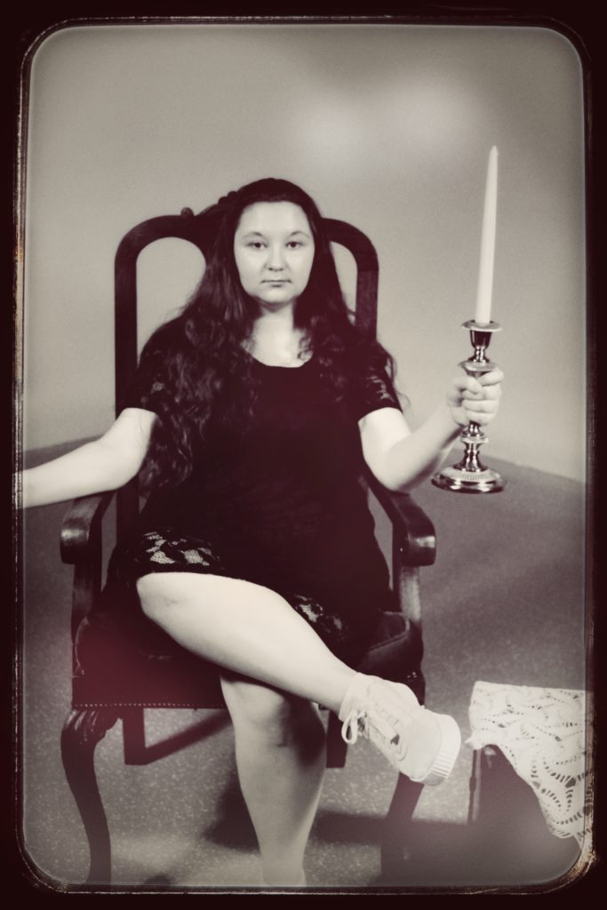
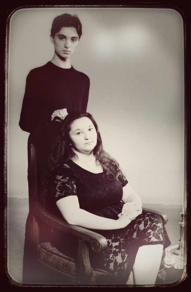
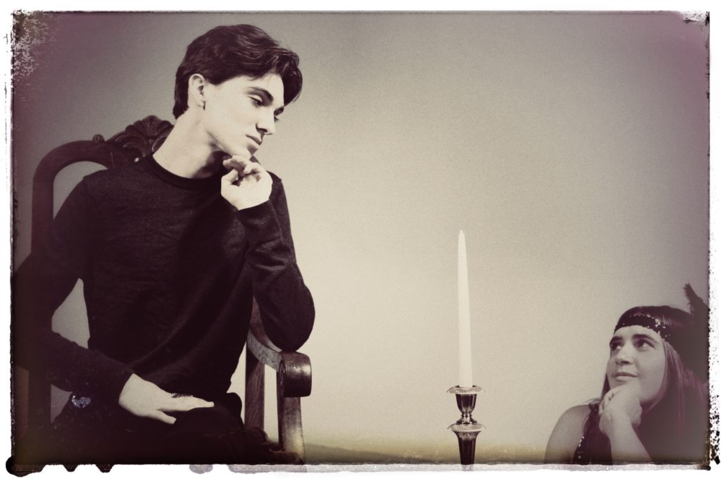
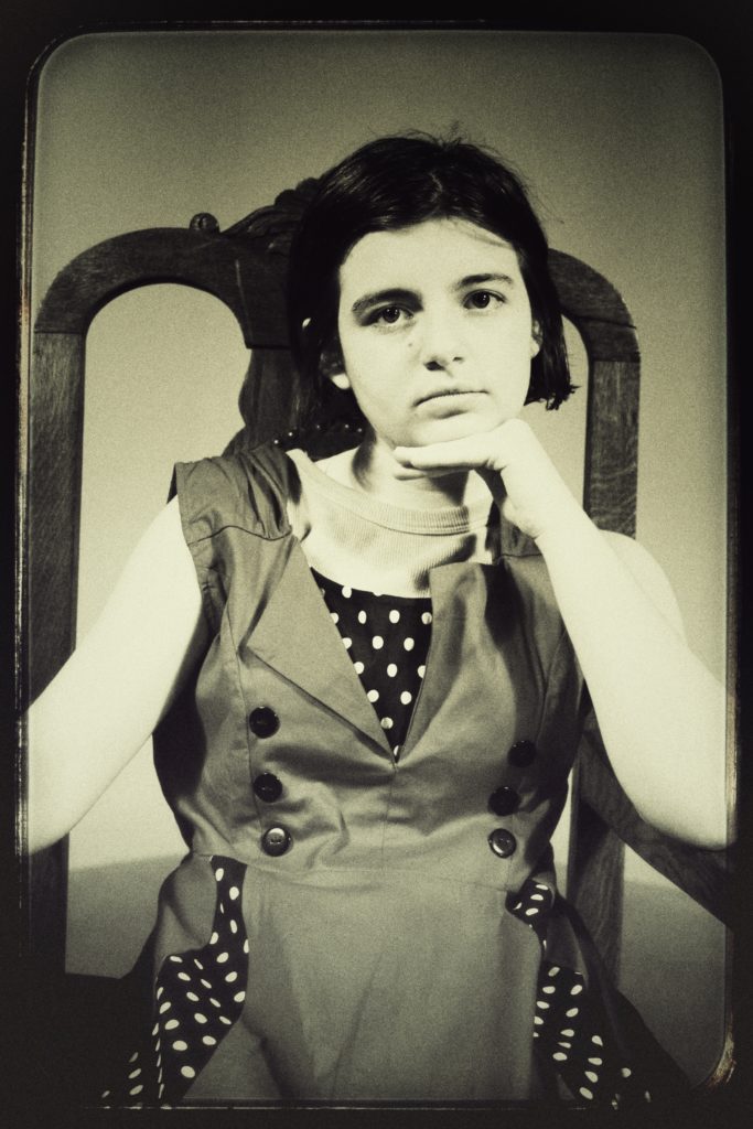
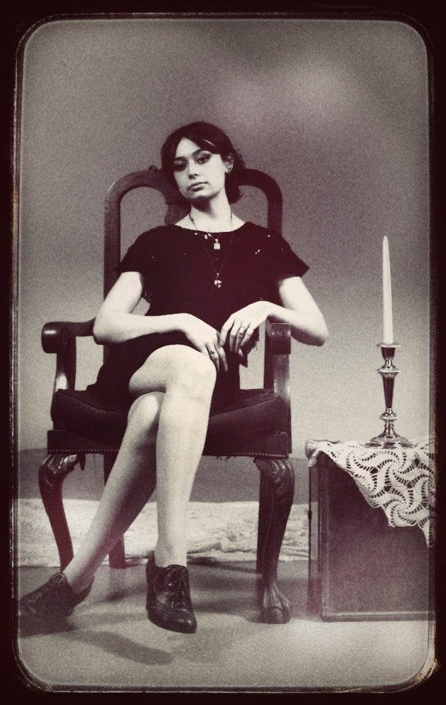
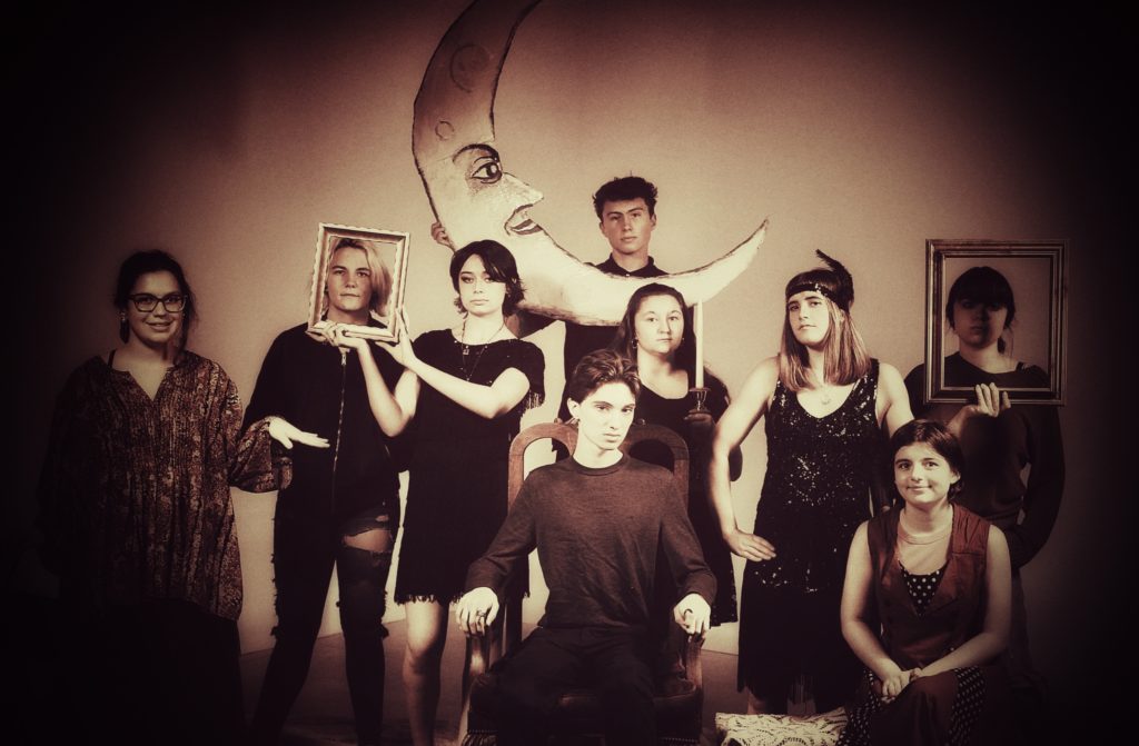
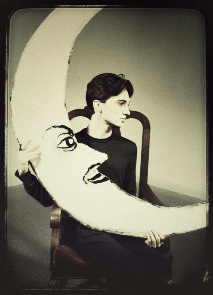
While these certainly aren’t all of the main people, we felt these best captured a professional and vintage aesthetic that goes in line with the art movements at the time of the Seahawk’s humble beginings.
There was much more humor in the shoot, however, and even though the posters will capture these 6 members in their full austerity, the team is much larger, and we had far too much fun. So, there will also be another gallery showcasing candids and other members posted in the coming days.
– Brady, Editor in Chief